In Milan, a city famed for clean lines and quite rigor, La DoubleJ speaks in pattern. Founded by editor-turned-designer J.J. Martin, the label bridges ready-to-wear and homeware through archival Italian prints, translating historic motifs into contemporary wardrobes and tablescapes.its world is less about singular statement pieces than about systems: a vocabulary of color, scale, and geometry that moves from silk to porcelain, from jacquard to glass, without losing its clarity.
This article looks inside that system. It traces how La DoubleJ mines heritage-textile archives,regional craft,and long-standing Italian workshops-and how those sources shape the brand’s visual language. It follows prints from page to product, considering the choices behind re-coloring, re-sizing, and placing motifs, and the collaborations that turn two-dimensional artwork into garments, linens, and objects. it examines style not as trend but as practice: how pattern is layered, balanced, and worn across daily life.
Inside La DoubleJ: Patterns, heritage, and Style is a study in continuity-between past and present, fashion and home, exuberance and order.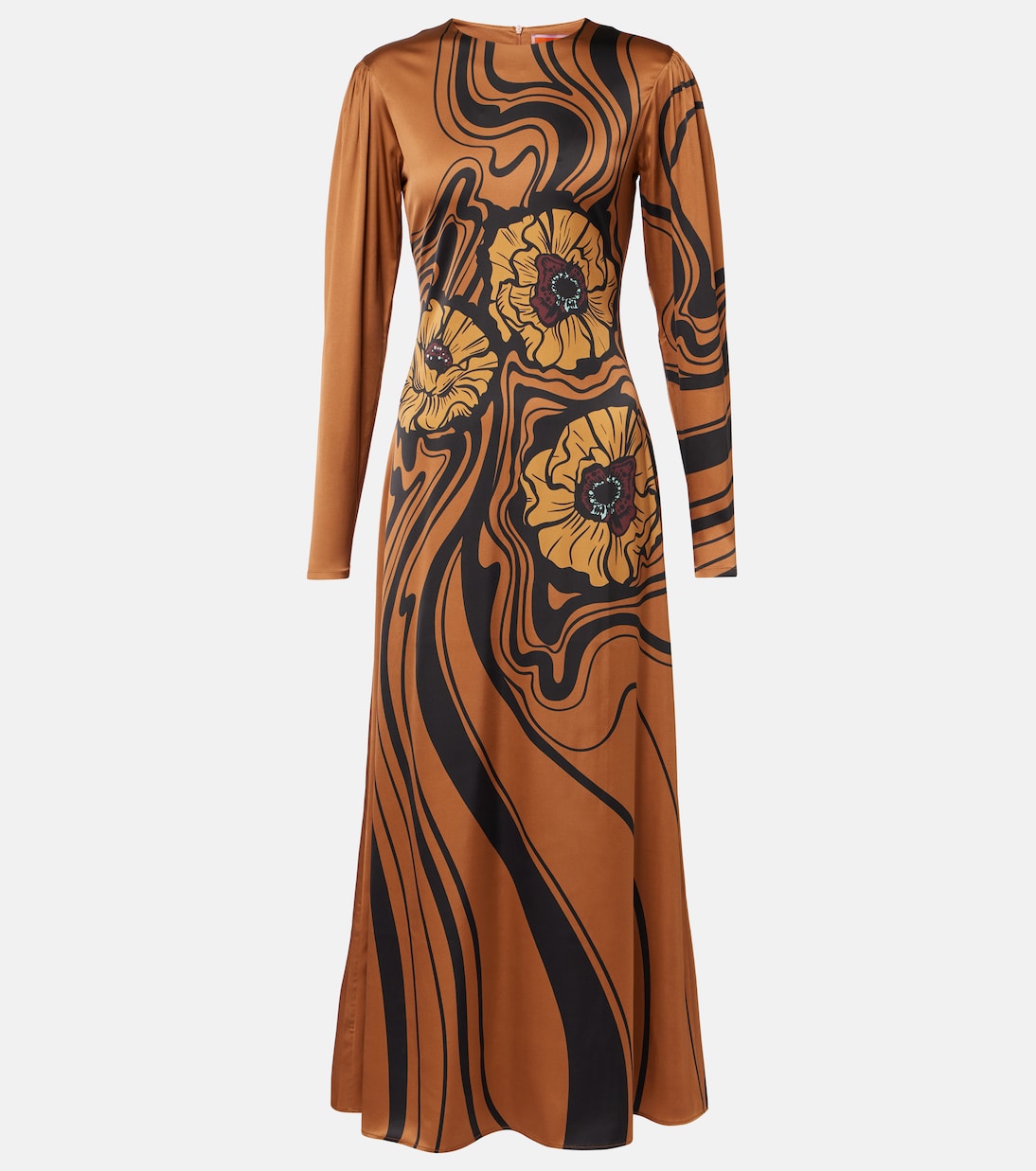
Inside the Archive: decoding signature prints and pairing rules for city days and resort escapes
The archive is a living library where early atelier swatches sit beside fresh reissues,and every motif carries a passport stamp of place and decade. Think bold geometrics sketched off mid-century tiles, hand-drawn petals preserved from silk scarves, and folkloric borders lifted from vintage table linens; together thay create a vocabulary you can actually read. Start by spotting the narrative: a micro-grid tempers exuberant florals, a heraldic stripe steadies dancing dots, a sun-bled pastel softens a saturated jewel tone. When you know the grammar-scale, tempo, and mood-city sidewalks and seaside promenades become parallel runways.
- Scale: Micro prints feel tailored; macro motifs read dreamy. Mix one of each for balance.
- Color tempo: neutrals are rest notes; brights are chorus lines.Keep one constant hue across pieces.
- Motif mood: Geometric = modern polish; organic = soft romance. Pair opposites for tension.
- fabric base: Poplin adds crispness, silk twill brings glide, stretch jersey gives travel ease.
- print handshake: Share a single color thread or invert light/dark values to harmonize.
Translating that fluency into outfits is a matter of anchoring silhouettes, then letting pattern do the persuasive talking. For urban hours, sharpen edges with structure and a grounded palette; for coastal ease, widen volumes and dial up luminosity. Accessories should echo form as much as color-a boxy bag for city precision, a woven tote for horizon-chasing nonchalance. Use one pragmatic piece to tether the look (a blazer or a linen overshirt), then let your hero print set the scene.
| Element | City Day | Resort Escape |
|---|---|---|
| Base piece | Structured blazer | Breezy kaftan |
| Print scale | Micro check + mini bloom | Oversized palm or petal |
| Palette | Ink, ecru, camel | Lagoon, coral, sun |
| Pairing rule | Anchor with solid trousers | Float with shell-toned shorts |
| Shoes | Loafer or block heel | Espadrille or flat slide |
| accent | Silk scarf knot | Beaded earrings |

Materials that Matter: Silk twill cotton poplin and stretch jersey and when to invest in each
Silk twill channels saturated color with a liquid drape and quiet luster, turning archival motifs into collectible statement pieces. It flatters fluid silhouettes-think scarf tops, bias skirts, and palazzo trousers-and rewards careful care with years of wear. Cotton poplin delivers crisp architecture and breathability,perfect for tailored shirting and day dresses that keep their shape from espresso to aperitivo. Meanwhile, stretch jersey hugs with ease, packing down to nothing, resisting wrinkles, and lending prints a soft, body-skimming finish that moves with you.
- Silk twill: Invest for event dressing, heirloom-level separates, and when you want maximum print depth and drape.
- Cotton poplin: Invest for structured daywear, warm-weather polish, and easy-care versatility.
- Stretch jersey: Invest for travel, comfort-first silhouettes, and wrinkle-resistant, pack-and-go styling.
Choose by context: climate and calendar. Opt for twill when shine and fluidity elevate the occasion; poplin when crisp lines and all-day breathability lead; jersey when movement, layering, and suitcase mileage matter. Consider print character,too: twill lends luminosity,poplin sharpens edges,and jersey softens contours.Longevity follows care-twill thrives with mindful storage, poplin loves the wash, jersey forgives and flexes-so align maintenance with your lifestyle for a wardrobe that endures without effort.
| Fabric | Best For | Feel | Invest When |
|---|---|---|---|
| Silk twill | events,heirloom pieces | Luminous,fluid | Color depth + drape |
| Cotton poplin | Shirts,day dresses | Crisp,breathable | structure + easy care |
| Stretch jersey | Travel,body-skimming | Soft,stretchy | Comfort + movement |

Color Strategy: Choosing palettes by undertone occasion and season for impact without overload
Begin with your skin’s undertone-warm, cool, or neutral-as the compass for choosing La DoubleJ’s jubilant hues. Echoing your undertone with an anchor color (think navy, camel, or stone) steadies even the boldest prints; then layer a single high-energy accent to make the pattern sing without shouting. Balance comes from scale and space: pair micro motifs with macro florals, and let whites or deep grounds act as visual comma marks. If in doubt, follow the 60-30-10 rule: one dominant shade, a supportive secondary, and a precise pop.
Fit palette to context and climate. For warm daylight events, lean into sunlit brights and breezy textures; for evening or winter, pivot to inkier anchors with jewel accents that catch low light. Translate maximalism to real life with the “anchor-echo-pop” formula: one grounding hue, one hue that repeats a print tone, and one crisp contrast in a shoe or earring. This keeps heritage patterns elevated and wearable from desk to dance floor, and lets accessories flex the mood across seasons and occasions.
- Warm undertones: anchors in caramel/olive; pops in marigold, coral, tomato; metals skew gold.
- Cool undertones: anchors in navy/graphite; pops in cobalt, fuchsia, emerald; metals skew silver.
- Neutral undertones: anchors in stone/taupe; pops in teal,persimmon,raspberry; mixed metals work.
- Print pairing tips: 60-30-10 color ratio; mix scales; keep a shared undertone to unify.
| Undertone | Anchor | Accent | Occasion | Season |
|---|---|---|---|---|
| Warm | Camel, Olive | Marigold, Tomato | Garden Party | Spring/Summer |
| Cool | Navy, Charcoal | Cobalt, Fuchsia | Gallery Night | Fall/Winter |
| Neutral | Stone, Ivory | Teal, Persimmon | Work-to-Dinner | all Year |

Wardrobe to Tablescape: Building a cohesive capsule from dresses to dinnerware with packable picks and care tips
Think of prints as a language: choose a tight palette,then let motifs speak across clothing and place settings. A deep emerald or inky navy grounds lively florals; echoes of saffron, blush, and ivory bridge a maxi dress to a linen runner without visual noise. Balance pattern scale-large blooms on a skirt pair with micro-dots on napkins; bold geometrics on a blouse soften beside a fine-rimmed plate. Texture builds depth: crisp cotton poplin against glossy ceramic glaze, matte linen beside smooth silk. A touch of metallic-gold-rimmed glassware, vintage brass cutlery-threads heritage into modern silhouettes without stealing the spotlight.
for travel, edit to a flexible core that packs flat and sets fast. Use the 3-2-1 formula: 3 colors (one dark anchor, one light neutral, one accent), 2 prints (one large, one small), 1 metal (gold or silver) to unify everything from dress to dessert plate.Lean on convertibles: a silk twill scarf doubles as a centerpiece or napkins; a reversible placemat flips the mood; stretch-jersey pieces roll without wrinkling. Keep care simple: cold wash,gentle spin,and air dry for linens; spot-clean silk; nest lightweight tableware with felt or cloth. The result is a capsule that layers heritage pattern with practical ease-ready for a piazza picnic or a candlelit kitchen counter.
- Palette: Emerald, ivory, saffron (swap saffron for blush at night).
- Anchors: Navy dress + natural linen = instant calm.
- Scale: Big floral garment, small-print table linen to balance.
- convertibles: Scarf → runner or napkins; belt → napkin ring.
- Texture mix: Poplin, silk, linen, glazed ceramic, brushed metal.
| Piece | Pack Trick | Care Note |
|---|---|---|
| Silk twill dress | Roll in tissue; store in mesh pouch | Steam, avoid direct sun |
| Stretch-jersey swing | Fold once, tuck at suitcase top | Cold rinse, lay flat |
| Printed scarf | Flat pack; use as table runner | Spot clean, light steam |
| Linen napkins | Stack with felt sheets | Warm iron while damp |
| enamel side plates | Nest with cloth between | Hand wash, towel dry |
Closing Remarks
At a distance, La DoubleJ reads less as a look and more as a language-written in repeats and recollections. Its patterns hold memory without nostalgia; its heritage functions as method rather than monument; its style moves with everyday rhythm rather of spectacle. Within this lattice, prints travel from archive to table to street, exploring how design can outlast a season and still feel present.
What remains, after the play of color and form, is a working proposition: dressing and decorating are acts of editing, choosing threads that speak to where we’ve been and where we are. La DoubleJ may keep drawing from history and setting it against contemporary life, but the translation is left to the wearer, the host, the viewer. Encounter it in a garment or a room, and the invitation is the same-look closely, take what resonates, let the rest breathe. Between past and present,a usable beauty persists.